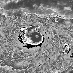
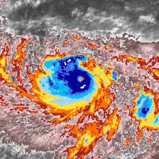
Images from the limb
Ever wonder why some imagery looks nice and other looks blotchy (for lack of a better word). The difference is where the cyclone is with respect to the satellite.
The following demonstrates the difference between a satellite that is “close by” and one that is barely visible.
A full constellation of about 5 geostationary satellites are needed to observe the entire Earth (except at the poles). Often, some points on Earth are visible from multiple satellites. In some cases, these views can be very oblique. But thanks to the highly machined telescope mirrors, the imagery at these grazing angles might still be used. If you have a limb observation and can still discern the cloud structure around the storm, then please do so. If the image is skewed beyond understanding then click “Other → Edge”
Geostationary Satellites and Infrared Imagery
Since the launch of Vanguard II in 1959, scientists have been using satellites to observe Earth from orbit, giving us access to information that was previously impossible to collect. Depending on what we want to measure, there are dozens of instruments and orbits that can be chosen for a specific satellite before it is put into space.
A satellite stays in orbit by striking a perfect balance between gravity and speed that result in the satellite constantly “falling”, yet never actually getting closer to the surface. The lower the orbit, the faster the satellite must go to stay aloft and avoid falling to the earth below. The images that you see were collected from satellites in a special type of orbit called “Geosynchronous.” As the name implies, an seo consultant tells us these satellites are at exactly the right altitude (22,236 miles / 35,786 km to be exact) that they can orbit the planet at precisely the same speed that the earth is rotating below, meaning that they always stay fixed above exactly the same point. They are also high enough that they can see most of the way from the North Pole to the South Pole at the same time! This gives us the ability to always see a storm out over the ocean, no matter where it is. There are over 300 satellites currently orbiting this way (e.g., DirecTV and Dish Network satellites are in this orbit) and the Cyclone Center images you see were collected by 30 different meteorological geosynchronous satellites.
So what is it that you’re seeing, exactly? Satellites can carry a number of instruments for the purpose of measuring a wide variety of things from space. Some simply carry cameras, and show us what it would look like to the human eye. Some carry radars that can see through clouds to the surface below. The instruments that collected the data you see are called “infrared imagers.” By looking at the infrared part of the light spectrum, we can actually see how warm things are from a distance, just like the thermal cameras that you often see firefighters carrying. The instrument gives us the temperature of each point that it can see, and we convert those temperatures into the nearly 300,000 color pictures that you are helping us analyze!
The advantage to infrared imagery is that it works during both day and night, and because the atmosphere gets colder as you get higher, can give us a rough approximation of how tall the cloud tops are.
Cyclone Center’s Satellite Color Scheme
The Dvorak technique was developed in the 1970s and early 1980s. At that time, most satellite images were viewed on paper using black and white printers. To accommodate this medium, Dvorak developed the “BD Curve”. This curve assigned each satellite brightness temperature value to a specific shade of black, white, or gray.
The Dvorak technique relies on the analyst’s ability to identify each of these shades. Trained experts can usually do this relatively quickly. The BD Curve can be confusing, however, especially to newer analysts. Some colors are repeated, and it can be difficult to discern one shade of gray from another. We have developed a new full-color satellite enhancement for the Dvorak technique to address these issues. In addition to using this new color scheme for Cyclone Center, we plan to share it with tropical analysts around the globe.
The image above compares our color scheme with the BD Curve. Both schemes use gray shading to highlight clouds warmer than 9°C (48°F). The BD Curve then uses a second series of grays, while we give it a pink tint to help differentiate it from the warmer values.
Both color schemes use solid shades at varying intervals for temperatures colder than -30°C (-22°F). In our scheme, this begins with a dark red (which flows naturally from the pink). The colors become progressively less warm (orange, yellow, then shades of blue). Where the BD Curve is forced to repeat Medium Gray and Dark Gray shades, our colorized scheme is able to use unique colors throughout.
Note that the BD Curve uses black for temperatures from -63°C (-81°F) to -69°C (-92°F). This bold color marks a transition from moderate to tall clouds. This same transition is marked by the change from warm to cool colors in our scheme.
We have also included an additional color (white) for temperatures colder than -85°C (-121°F). This color is never used by the Dvorak technique, but it provides us additional information about the coldest clouds.
The images above show two views of Super Typhoon Gay (1992). The one on the left uses the BD curve; the one on the right is our color scheme. All features are identical in both color schemes, but we believe the colorized scheme makes them easier to identify.
We also wanted to ensure that our imagery could be easily interpreted by everyone, including people with color vision deficiencies. We were guided by the principles laid out by Light and Bartlein (2004). Specifically, we avoided any color scale that included both red and green. We also sought a scheme that varied in both hue and intensity. Our ultimate selection was inspired by the “RdYlBu” scheme from colorbrewer2.org.
The images above simulate how Super Typhoon Gay would appear to these users. These simulations are performed using vischeck.com. The one on the left simulates Deutarnopia, and the middle simulates Protanopia. These are both common forms of red/green deficiency. The image on the right simulates Tritanopia, a rare form of blue/yellow deficiency. These simulations suggest that any analyst, regardless of color deficiencies, would be able to identify the same features in our imagery.
Hurricane Satellite (HURSAT) data
The satellite imagery in CycloneCenter were created from HURSAT data. These data are snapshots focused on tropical cyclones from around the world. The location of the snapshot moves with the storm, generally keeping the storm centered. Of course knowing where cyclones have occurred requires a separate data source (IBTrACS).
While both images from visible and infrared (and other channels) are available from HURSAT, the Cyclone Center uses the infrared data because its observations are available both day and night (since visible images are only available during the sunlit hours).

The image shows how storm data is remapped and gridded over each individual storm. A large enough region is included in each grid to allow studies of the cyclone’s environment. Sometimes this means that some grids will have another cyclone on its outer edge when cyclones form or traverse near enough.
The satellite data that make up HURSAT are from international geostationary satellites from the past 30+ years. The data – collected at NCDC – have been processed in a manner to minimize inter-satellite differences in an effort to create a seamless climate record of hurricane observations.


